


For Artist Series stamp No. 15 Jeff Keedy and Ian Lynam have joined forces. We’re quite happy to collaborate with these two distinguished graphic designers, educators, and typographers.
Mr. Keedy is an educator, designer, type designer, and writer, who’s been teaching in the Graphic Design Program at California Institute of the Arts since 1985. His typeface Keedy Sans was added to MoMA’s permanent collection in 2011. Ian works at the intersection of graphic design, education, and research. He is faculty at Temple University Japan, Vermont College of Fine Arts, and at Meme Design School in Tokyo. Ian writes for IDEA (JP) and Slanted (DE) and has published a number of books about design.
Interview
Have you designed a stamp before?
Mr. Keedy: No but it is something I have always wanted to do.
Ian: I designed a series of poster stamp-esque designs for my old Poster Initiative series of freebie posters that I put out almost a decade ago. This was different in that it was collaboration with a friend, mentor, and someone I respect immensely.
What was the most interesting or fun aspect of designing a poster stamp? What unique challenges did it present?
Keedy: Ian asked me to design this with him, I don’t collaborate very often, much less on such a small object. But it sounded like fun and we had wanted to design something together. It may seem like overkill to have two designers for something so tiny. But since we both design type we are comfortable working on a small scale and we know that small does not equal insignificant. How big is a typeface or an idea?
Ian: This project was interesting in that it helped connect an aspect of history I’ve been researching to contemporary practice. I’m writing a book on the history of Japanese graphic design and one of Japan’s first graphic design magazines was called Affiches—the premier issue contained a page of poster stamps. I wondered for years whether that was where poster stamps were first introduced to Japan, then just a few months ago I uncovered a Japanese magazine called The Show Window which was published in 1915 that introduced poster stamps to the Japanese public for the first time. Being invited to make one, especially with someone else as invested in the cross-section of theory and practice as I am, made this project really meaningful.
Tell us about the art. Did you create something new for this stamp?
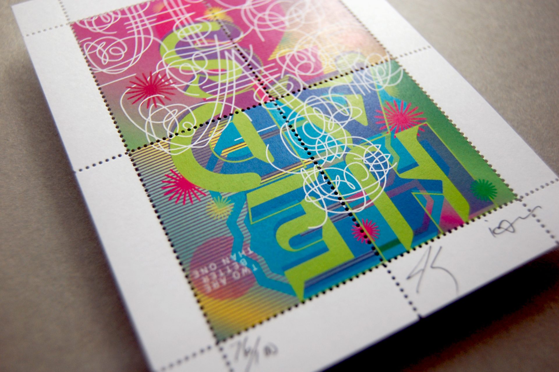
Ian: We worked off the idea of “work and turn,” making a composition that might be flipped either way and still be appealing. I created some new lettering based on the skeletons of Dutch designer Henk Krijger’s Raffia, a favorite of mine, integrating it with some new type designs of mine.
Keedy: In a collaboration you don’t know where it is going until you get there. I don’t think it looks like anything either of us would have done on our own. So it is new to us, but also old in that we used our own typefaces too.
Anything else?
Thanks for the opportunity to collaborate and share our work with others.